Work / Marigold Coffee
Case study · MGR-2025
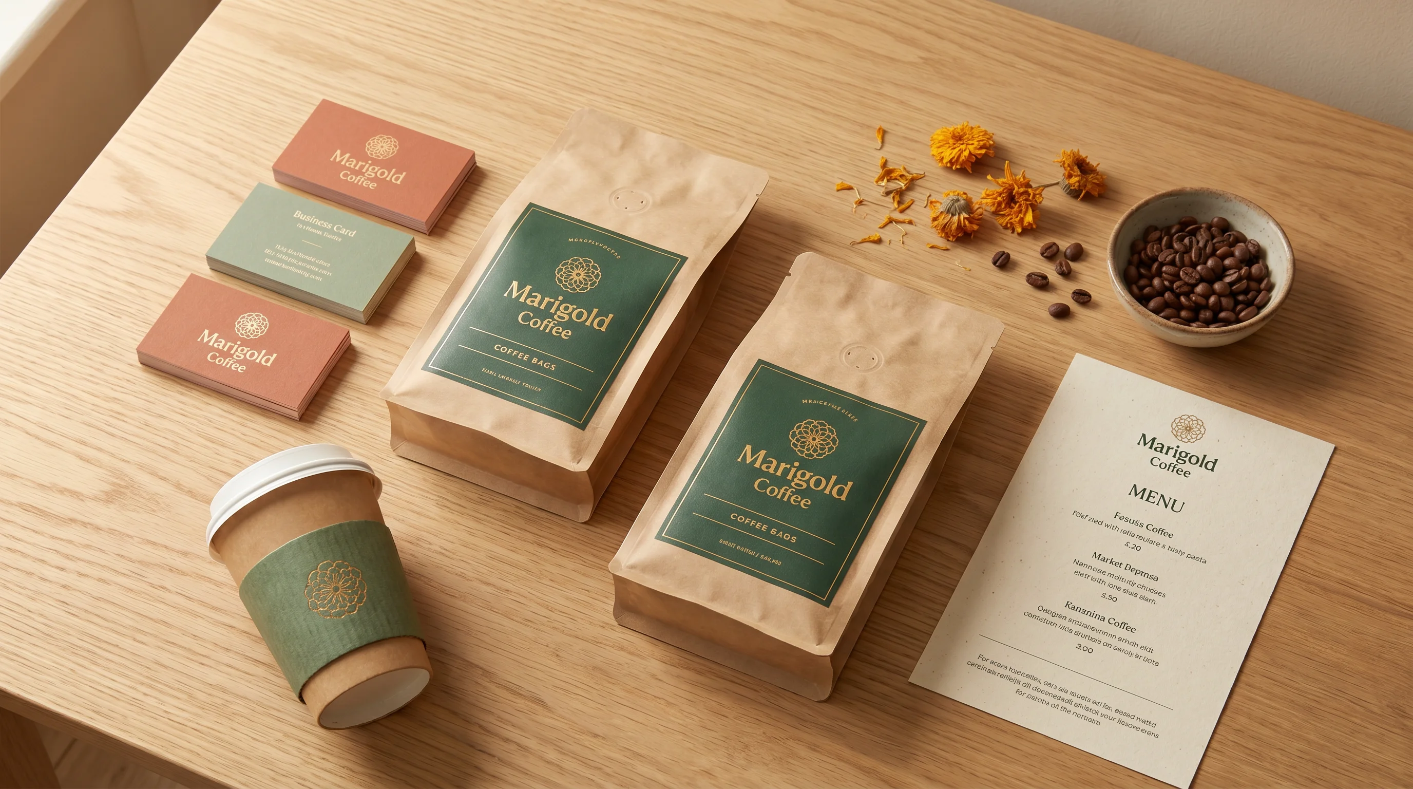
A small-batch speciality roaster in Indiranagar, Bengaluru. We developed the full identity and packaging system over four weeks in early 2025, in time for their retail launch.
Client
Marigold Coffee
Sector
Food & beverage
Scope
Identity · Packaging
Delivered
Early 2025
01 — The brief
Marigold came to us with a finished product and a rough launch date. A small-batch specialty roaster opening a retail counter in Indiranagar, they needed an identity that felt handmade without tipping into cliché — warm, grounded, and honest about being a two-person operation.
The brief asked for three things: a wordmark that worked at small sizes on bag labels, a colour palette that sat comfortably against roasted-bean browns, and a packaging system that could accommodate four origin-specific SKUs at launch with room to grow.
02 — Process
01
A studio visit at their roastery, a short written brief, and reference-gathering across coffee, botanical prints, and mid-century Indian packaging.
Week 1
02
Three wordmark directions presented in context. One was chosen and refined over two rounds, paired with a custom ligature and a simple botanical monogram.
Week 2
03
Colour palette, typography, and a four-SKU bag-label system with origin-specific accent colours. Print-ready files delivered with a short usage guide.
Weeks 3 – 4
03 — Deliverables
Files handed over as a single Google Drive folder, with a one-page usage note and a short walkthrough call at handover.
01
Primary wordmark
With horizontal and stacked lockups, plus an alternate short mark for small applications.
02
Monogram
A compact secondary symbol for bag seals, social avatars, and stamp applications.
03
Colour system
A primary warm cream, a deep roast brown, and four origin-specific accent hues.
04
Typography
A serif display paired with a humanist sans for labels, menus, and signage.
05
Packaging
Four bag-label designs (250g / 500g), ready for the chosen kraft-bag supplier.
06
Mini guidelines
An 8-page PDF covering usage, spacing, typography, and colour application.
04 — In context

Note: design is collaborative work. Outcomes depend on the brief, feedback, and decisions made together along the way. We do our honest best on every project but cannot promise specific business results from identity work alone. Images shown are of the delivered system and are published with the client's permission.
Have a brand to launch?
If this case resonates with what you're building, send us a brief. We reply within one business day.
Phone & WhatsApp
+91 87679 24738